Following on from Rafe's introductory look, on video, at the Nokia 500, the cheapest Symbian smartphone of the modern era, I look in more detail and its form, function and performance. It's worlds away from flagships like the N8, but does it still have a place on today's phone market? And if you pick one up as a backup smartphone or for a family member, what compromises will you/they hit?
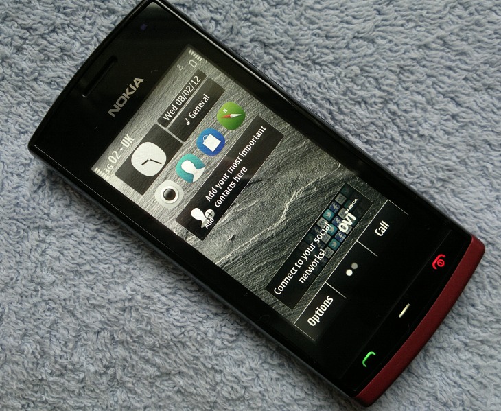
Key hardware features
- 111.3 x 53.8 x 14.1mm, 93g, 73cc
- Changeable back covers, three are included with each Nokia 500, and additional covers will be available as accessories
- 3.2 inch capacitive TFT touchscreen; 640x 360 pixels resolution (nHD)
- 5 megapixel full focus (EDoF) camera (no LED flash); video capture at 640 x 480 (VGA and 15 frames per second)
- Integrated GPS
- Compass (magnetometer), accelerometer, proximity and ambient light sensors.
- 3.5 mm audio jack
- FM Radio with RDS
- microUSB (USB 2.0) for file transfers and charging (2mm charger also available)
- BL-4U (1100mAh) removeable battery
- Pentaband 3G, quad band GSM
- WiFi: WLAN IEEE802.11 b/g and Bluetooth 2.1
- Processor: ARM 11 at 1GHz, RAM: 256MB
- 2GB mass memory and microSD card slot (supports sizes up to 32GB)
- In box contents: Nokia 500, Nokia Battery BL-4U, Nokia Connectivity Cable CA-101D, Nokia Headset WH-102, Nokia High Efficiency Charger AC-15 and 2 additional battery covers.
Nokia 500 hardware
With the headline takeaway being that this is Nokia's cheapest Symbian^3-onwards smartphone, at around £140 SIM-free in the UK, it's somewhat staggering to look at the specifications and match them up to Nokia's most expensive smartphones of 2008 and 2009. With digital compass, dual charging, capacitive touchscreen, pentaband and a 1GHz processor, it's still somewhat remarkable to find such goodies in something that's very firmly the bottom of Nokia's modern Symbian range.Yet bottom of the range it ultimately is, in the context of 2012. The two dominating limitations in the Nokia 500 are its memory and its screen:
- By 'memory', I mean RAM, in this case. Although it starts with the same 256MB as the Nokia N8 (et al), because there's no GPU (i.e. a graphics chip, with its own RAM and capabilities), around 64MB of the Nokia 500's RAM is allocated to handling graphics duties (a unique situation in the modern Symbian world, thankfully), leaving the smartphone with just 66MB or so free RAM after boot-up.
To put it into context, this is less free RAM than many S60 3rd Edition phones (e.g. Nokia N82, N95 8GB, E90) had back in 2008. The end result, somewhat predictably, is that even moderate use of the phone (Web, Camera, Social, Store, and so on, all left running) sees the user slamming into RAM problems, occasional error messages and applications that you thought were still running getting shut down.
Whether this will be a huge issue to the target market is another matter. It's fair to say that noone's going to be blown away by the 500's performance, but for many simple tasks it's up with most of the competition. Yes, as an AAS reader and power user, you're horrified by that statement, but then you're absolutely, 100% not the target audience for this phone.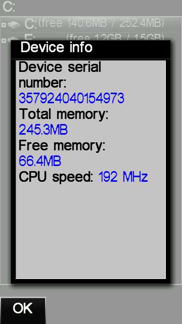
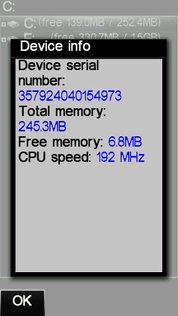
RAM diagnostics within X-plore on the Nokia 500. 66MB free after booting, down to 7MB free with just four core applications open. Power users stay away!
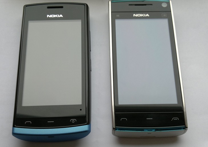
- The screen's seemingly identical to the sidelit TFT 3.2" display on the Nokia X6 (which was Nokia's first capacitive display, you may remember?), meaning that it's not strikingly clear outdoors (no CBD layers, for example) and not strikingly colourful (no AMOLED here!) The screen is one of the most expensive components in a phone, mind you, so it's not surprising that compromises had to be made here, to get the cost down further. I would have liked to have seen CBD, but hey....
The outer layer of the 500's screen is, sadly, plastic, albeit fairly tough, another economising measure (compared to the plain glass on the X6 and the Gorilla Glass on the N8, C6-01, etc.) This is something of a shame as the target market is not known for taking obsessive (geeky) care of their handsets, and the 500's display is liable to get scratched as easily as any other plastic device.
A 3.2" display has always been a bit cramped for text entry using the qwerty keyboard in landscape mode on Symbian (as on the original 5800), it's still cramped here, but the text prediction alleviates this somewhat. In portrait mode, I just about managed to type reliably, but anyone with big hands and fingers will struggle. The option to use a T9-style 'alphanumeric' keypad is still there, and works rather better, in my opinion - and will hopefully be familiar to those coming to the 500 from a fairly dumb feature phone.
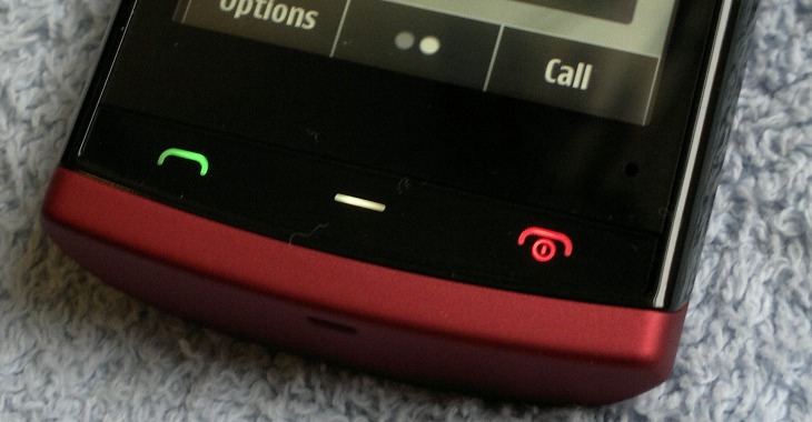
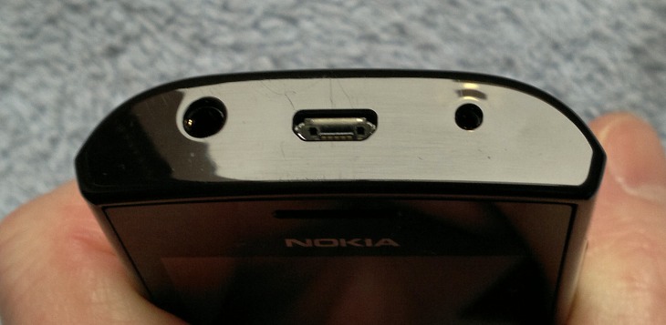
Significantly, there's no camera shutter button, not even a cheap affair, possibly signalling a lessening of expectations for what the 5mp EDoF camera will produce (interestingly, later proven wrong, as we shall see).
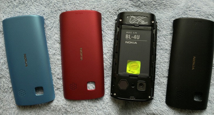
The shells are plastic (of course), but are surprisingly robust and solid. Moreover there's a really grippy rubberised coating on each that makes the Nokia 500 almost impossible to drop. Very, very nicely done, Nokia.
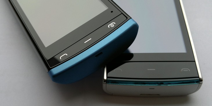
I made comparison to the Nokia X6 above - despite the latter's generally higher specifications (processor and software version aside), the two phones are surprisingly similar, here showing the 500 with blue cover in place (left) next to the blue/white X6 (right):
Nokia 500 Software
There's no power button on the 500, the hangup key (which lights in red when pressed) doubles this function and you're then into a standard Symbian Anna experience, complete with swipeable homescreens, split-screen qwerty keyboard (or keypad) where needed and a generally mature set of software. Nokia Belle is coming, apparently, though I can imagine that there are serious RAM optimisations having to be attempted - and this will take a few weeks or months...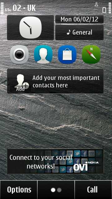
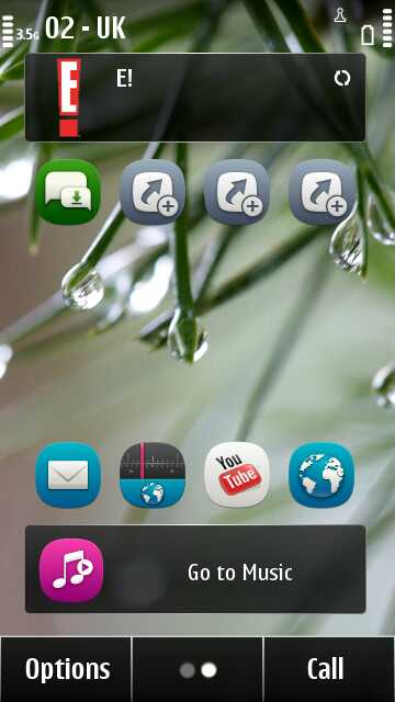
- Nokia Maps (a full world sat-nav in your pocket, etc - Maps 3.6 is included)
- Nokia Social (v1.3 is included, and its Facebook and Twitter capabilities will be fine for the target market, with the benefit of integration with the camera and Photos).
- Nokia Internet Radio (given prominence by being on the second home screen out of the box)
- Nokia Store ("hey, this Nokia has got an app store just like the iPhone's")
Heading for the web browser, as a power user might, is possibly fraught with performance problems, depending on the site being visited. Most other applications load quickly enough, though graphical effects (such as scrolling around in the Nokia Store) are jerkier than on the 500's more powerful sister devices, thanks to the lack of a GPU.
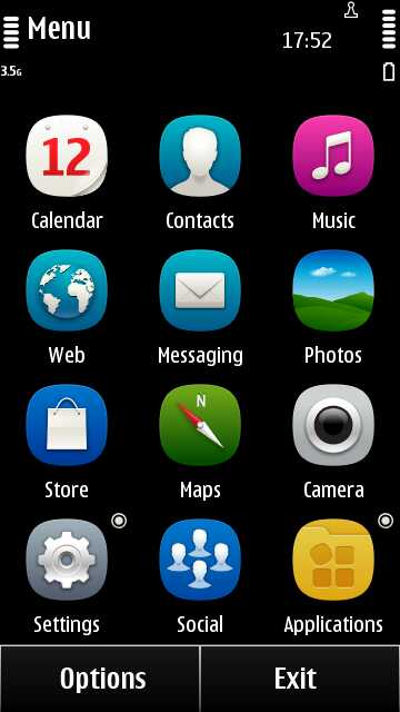
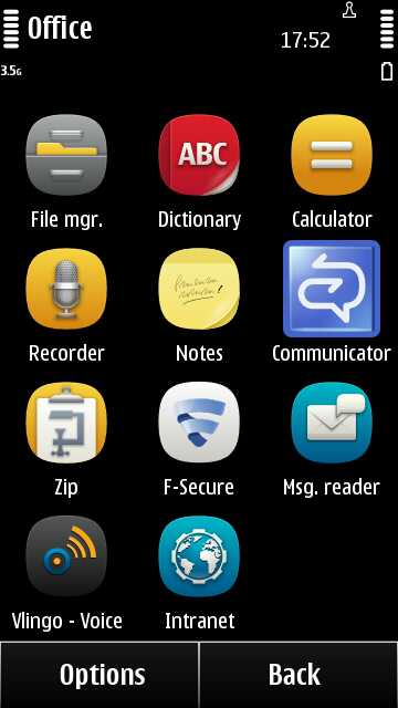
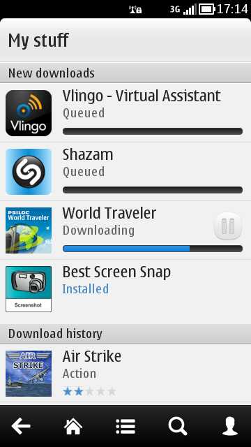
Familiar software all round, some of which is distinct overkill for the buyer of a £100 pay-as-you-go smartphone - or tremendous value, depending on which way you look at it! Of note is that there's a Nokia Store update as soon as you enter the client, followed by a number of updates to built-in third party applications.
Games in particular are also affected. I tried Mobile Darts (which ran fine) and Air Strike (which was noticeably jerkier than on my N8), and wanted to try Angry Birds, but it seems that this won't run at all without a GPU and (probably) with so little RAM. All the other heavyweight 'HD' games from the Symbian^3 scene are also incompatible with this budget smartphone. Although it's tempting to get a 500 for the kids because of the low cost, don't - their focus will be on gaming and they'll end up disappointed.Where the Nokia 500 will find its niche is for those who want some of the characteristics of a smartphone (capacitive touchscreen, apps, connectivity) but aren't games or media-centric. Quite telling on the 500 is the prominent placing of a 'Chat' icon. This takes the user directly to the relevant section of the Nokia Store, where Nimbuzz, eBuddy, fMobi, IM for Nokia, WhatsApp and fring are all readily available (and all but one for free).
Media and camera
One thing a GPU is used for, of course, is hardware decoding of compressed video files - which is why the N8, E7 (et al) are all so excellent at playing back video, even up to 720p resolution at high bitrate - it's all handled in hardware. Take away the graphics chip and what do you get? You get a video experience that's very 2009.Of my test video collection, almost all of them played to some degree - the codecs are there in Symbian Anna, after all. But anything at 720p resolution (or even greater than VGA) and with appropriate bitrate showed lots of artefacts, where the decoding was having to be done in software by the 1GHz main processor. Having said that, many videos were watchable and, again, I doubt the target market for the Nokia 500 is going to be sideloading 720p video clips like I was!
The other two common ways of experiencing video on phones (for normal users!) are via YouTube and via video captured on the phone itself. YouTube isn't a pleasant experience, as implemented here. Mind you, Nokia is stuck between a rock and a hard place in terms of support for this and other Google services - the old Symbian YouTube client is reliable but only uses low-res QVGA video streams, while the solution here - to link to the YouTube mobile site - produces ultimately better video quality but relies on the novice user somehow figuring out how it works (start a video playing, then double-tap to bring it full-screen).

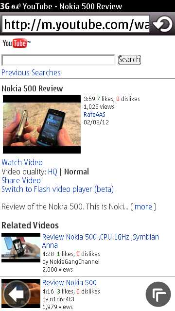

Typical video quality through the YouTube mobile site
Curious as to how far I could push the Nokia 500 hardware, I installed the excellent CuteTube and found video watching painless and trouble free. Fast moving sequences juddered a bit, but the 1GHz processor was up to the job of keeping most video material watchable. Maybe Nokia could license CuteTube, as a counterpoint to the official YouTube client in the rival low cost Android smartphones?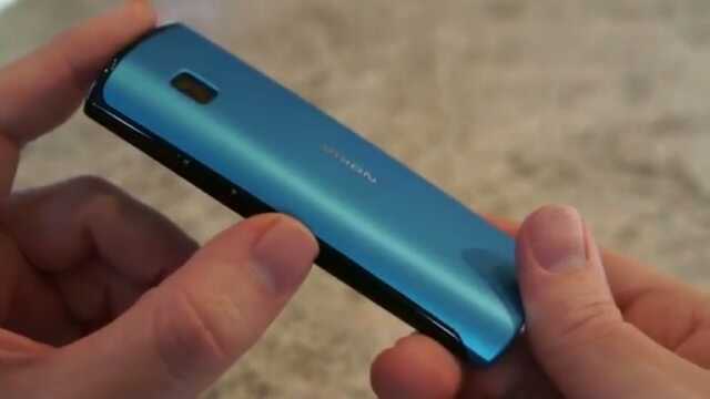
Frame grab, watching a higher quality stream (of Rafe's video review) through CuteTube...
Playback of video clips shot on the 500 is surprisingly good and clear, though the user will have to work out for themselves to tap the screen for each video, pick the appropriate icon and change the 4:3 aspect ratio to fill the 500's screen, if needed. Such (apparently high quality) material is somewhat illusory though, since the absolute video quality is fairly low, at VGA resolution and only 15 frames per second. Here's a very short clip:But then again we're not really expecting top notch 720p video in a device of this class, so there's no real complaint from me.
The Nokia 500's camera is EDoF, also known as "full focus", meaning that everything (in both video and photo modes) from 40cm to the horizon is crisp, provided that there's enough light. Here's a selection of sample stills, the first three in weak winter sun. As usual, in each case, click an image to open it in a new window full-size, or to download:
For such an unashamedly budget smartphone, I was very impressed by the photos from the Nokia 500, they're far better than the results I got from the more expensive Nokia 700. Enlarge a couple of these and see if you agree with me. The second one above shows that reasonable close-ups can be achieved, provided you don't get too close.
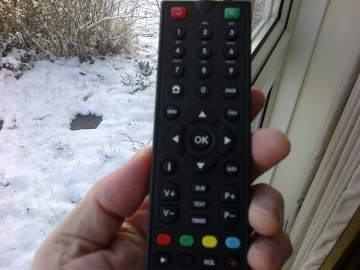
Another beautiful EDoF photo in the sun, though download the original and zoom right in and you can see the artifacts, as you'd expect. In the right hand shot above, I show what happens if you get too close to a subject, here with a TV remote at about 20cm - the EDoF algorithms can't cope and you get a blurred subject.
All in all though, for an ultra-cheap smartphone, the Nokia 500's camera impressed. Yes, results deteriorate when you get to indoor, low light shots, not least because there's not even an LED flash, but then results disappoint here for just about any non-Xenon-flashed smartphone, so the 500's in good company.
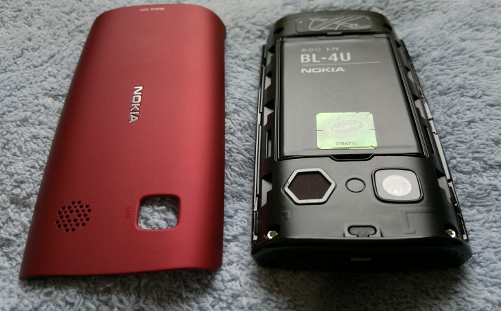
Here's the Nokia 500's camera unmasked, along with a mysterious spacer where, presumably, there was once the possibility of an LED flash in the device's specification. On the left is the fairly large speaker grille. This pumps out a fair old volume, equivalent to one of the 5800/X6's speakers, with reasonable tone and good, crisp top end. Yet again keeping to the audio pseudo-rule that the cheaper the phone, the more likely it is to have a loud speaker - bizarre!
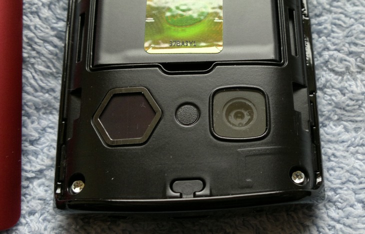
Also shown, in part, above is the BL-4U 1110mAh battery - this may not seem capacious by superphone standards, but with the use case of the Nokia 500, it provides stunning battery life. My review period for the 500 spanned a week and I only needed to charge the phone once. Impressive.
Head to head
It's interesting to compare the Nokia 500 with a competitor from another smartphone ecosystem. In this case, the closest match from the Android world, selling at the same price on pay-as-you-go and on contract, is the Samsung Galaxy Y. This smaller, ultra-budget entry in Samsung's all-conquering Galaxy range, looks good as it runs Android but is actually significantly outgunned by the Nokia 500:- dual band 3G (the 500 is pentaband)
- display is 3", 240 by 320 pixels, (the 500 is 3.2" and 360 by 640 pixels)
- no mass memory (2GB on the 500m plus the same expansion capability)
- 2mp camera, QVGA resolution video capture, 15fps (the 500 is 5 megapixels, VGA video capture)
- 830MHz processor (1GHz on the 500, though we all know that processor speeds rarely tell the full story)
Wrap up
On the one hand, we have here a fully fledged Symbian Anna smartphone with specifications that match what was top of the range just a few years ago, that is robust and feels great in the hand - all for £100 or so on pay-as-you-go, or free on the smallest phone contracts. Just stunning, if you think about it that way. And it has a surprising amount to recommend it to a feature phone user who's upgrading. After all, they won't be expecting being able to multitask a dozen applications or a super-slick iPhone experience - the buyer knew what was available for four or five times the cost and the Nokia 500 was largely a cost-based decision.This is All About Symbian though, and although we cover the whole ecosystem, there's a natural leaning in our readership to explore the best, fastest and most gadget-packed devices available. These things the Nokia 500 isn't. As a self-confessed power user, the low RAM, the lack of a GPU, the plastic screen and the low-spec video capture are all showstoppers. Turn the 500 over to my wife though and "this is nice, it fits really well in my hand" - for her needs the Nokia 500 is arguably just about the perfect device, won't cost a lot and is eminently replaceable if/when it gets lost or damaged.
The tech media has dismissed Symbian smartphones (utterly wrongly) for three years as 'no better than feature phones', and in the Nokia 500 they might have a point. However, I'd argue that it sits squarely at the intersection between the two markets and, as such, perhaps has a niche all of its own.
Steve Litchfield, All About Symbian, 12th February 2012
Reviewed by Steve Litchfield at
- GSM frequencies :850 900 1800 1900
- Standard UMTS : 900 1700 1900 2100
- Standard CDMA :
- UMA :
- Type :
Touch - Dimensions (W x H x D) :
111,30 x 53,80 x 14,10 mm - Weight :
93,00 g - Main display :
Color / TFT
16M colors
360 x 640 px (3,2") - Talk time (max.) :
2G: 420 min. (7,0 h)
3G: 300 min. (5,0 h) - Stand-by (max.) :
2G: 504 h. (21,0 days)
3G: 456 h. (19,0 days) - Standard battery :
Li-Ion 1110 mAh - Phonebook memory :
- Internal memory :2 GB
- RAM memory :256 MB
- Memory cards :microSD, microSDHC (up to 32 GB)
- Operating system :
Symbian Anna - Processor :ARM11
- Processor clock :1,00 GHz
- Touchscreen :
- SAR (10g) :1,18 W/kg
- DualSIM :
- Announced :

 Unknown
 Selasa, 17 Juli 2012


Tidak ada komentar:
Posting Komentar